Screen Layout & Navigation
Most KC screens have design constants such as a header, body, and footer. The header displays the KC logo on the left, menu tabs in the center, and a feedback e-mail link on the top, right.
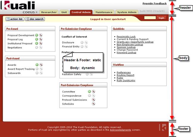
A horizontal toolbar separates the header from the body with workflow action buttons on the left, a display of your user name, and a login tool that allows for impersonation of other user roles (used for system diagnosis and training demonstration).

While the header and footer remain static, the body area is dynamic depending on which piece of functionality has been selected. When e-docs accessed from a menu screen and are currently displayed, the body contains e-doc page and e-doc section tabs. Lastly, the footer displays copyright information and the small “k” logo.
The following topics briefly describe the purpose and function of each of the major screen elements in KC:
Horizontally laid out across the top of any KC screen (header area, to the right of the KC logo) are tabs that have the look of file folder tabs.
The KC user interface is organized at the highest level by five menus that appear as having the look of file folder tabs at the top center of the screen (header area, to the right of the KC logo) – Researcher, Unit, Central Admin, Maintenance and System Admin. They are laid out horizontally across the top of any system screen.

Figure 20 KC Menu Tabs
The menu that is currently displayed is highlighted in red background with white letters, while the hidden menu tabs have black label text and tan backgrounds.

Figure 21 Menu Tab Navigation Example: Navigating to a different menu
When you hover your mouse cursor over a hidden screen tab, you will see that your arrow icon is changed to a pointing hand, the label text becomes underlined, and tip text pops up to indicate that you are able to click to select and display the menu.
Menus
Menus contain Groups.
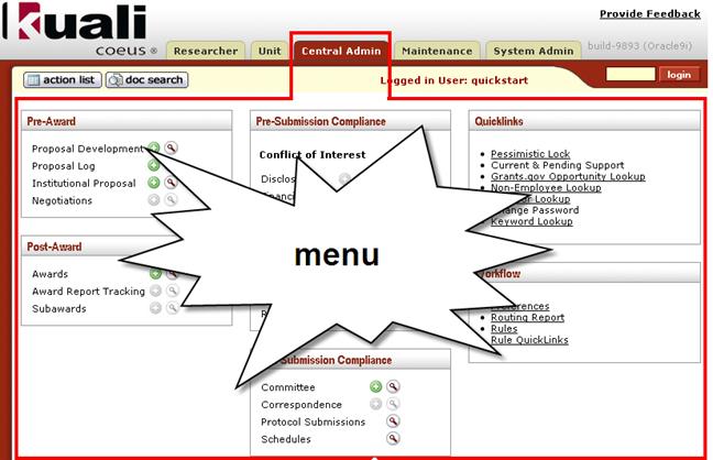
Figure 22KC Central Admin Menu Example
Groups
Groups are boxes that contain lists of functionality that can be accessed via icons or links. The boxes have red heading text and occasionally black, bolded subheading sections that group functionally-related features.
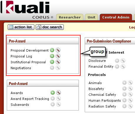
Figure 23 KC Group Box Example
Group Icons
Lists of e-docs displayed in Groups contain icons for creating new and searching for existing document.
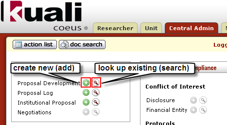
Figure 24 KC User Interface Icon Buttons for Create New and Look Up E-Docs
Group Links
Some Groups display bullet lists of underlined text that function as links to other areas of KC (usually to either e-docs or lookup screens). Clicking an underlined link causes a new screen to appear (which dynamically changes the body portion of the web screen).
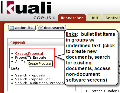
Figure 25Group Link Example: Create Proposal Link in Proposals Group
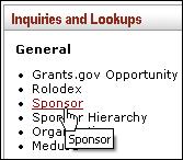
Figure 26 Menu Link Example: The Sponsor link in the General section of the Inquiries and Lookups menu group
 Group Sections